
What Makes this Stamp Great?
Analyzing some of the phenomenal 1869 Pictorials in the upcoming Rumsey sales.

There’s a cool, middle-aged white musician dude on YouTube with a video series called “What Makes this Song Great?” that I occasionally enjoy watching.

The dude (his name is Rick) picks one song in each episode and breaks it down, explaining the theory, the chords, the beat, the various tracks and components, and how it all comes together to make a great song. I’m not a musician, but I feel like a much smarter listener every time I watch one of his episodes.
I do find myself wishing somebody would do the same thing for philately—like, “What Makes this Stamp Great?” Come to think of it, though I’m pretty sure I’ll never be as cool as Rick, I could give it a shot here in my newsletter. Who knows, if this gets enough likes maybe I’ll get a haircut and a black t-shirt and make a YouTube video just like Rick.
There are certainly some very great stamps in Schuyler Rumsey’s sales coming up in a few days at the big summer stamp show in Sacramento. I could probably do many episodes of “What Makes this Stamp Great?” just looking at the Peter Iwate collection of classic United States (big PDF here), particularly the 1869 Pictorials.
Eighteen hundred and sixty-nine was an exciting year to be alive. The first professional baseball team—the Cincinnati Reds—was formed, the Transcontinental Railroad was completed, Ulysses S Grant became president and the United States Post Office Department issued a new set of stamps.
OK, that last one wasn’t particularly exciting if you’re not a philatelist. But if you are a philatelist, then it was a big deal, because those 1869 stamps—there were ten of them, ranging from 1¢ to 90¢—are probably among your favorites of the entire 19th century.
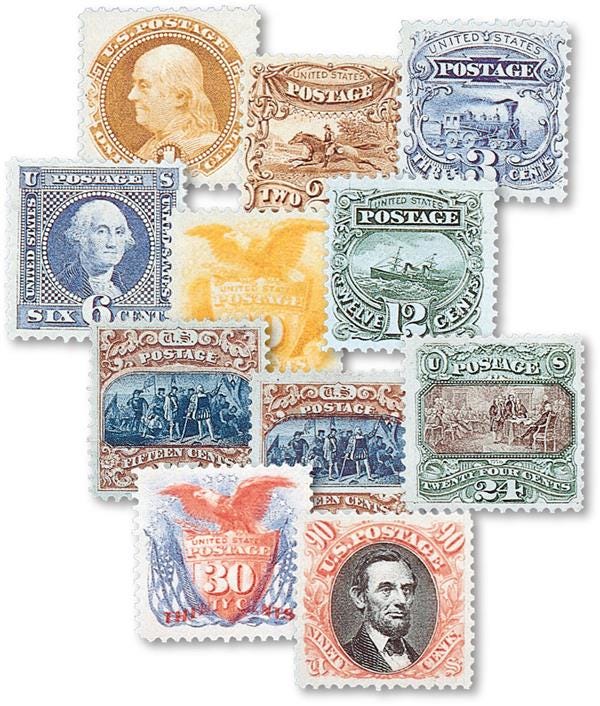
This series is pretty great overall, because it marked the first time the U.S. had gotten away from showing only Washington, Franklin and other dead white men on stamps and tried pictorial subjects such as an oceanic steamship or the Signing of the Declaration of Independence. In the aftermath of the Civil War, the subjects were both nostalgic, harkening back to the democratic ideals of the nation’s founding, and forward looking, hinting at American technological prowess to come. The 1869 Pictorials set an example for patriotic imagery on stamps that would be echoed many times by countries around the world.
It was also the first time any U.S. postage stamps were printed in two colors. The innovative, square-ish format had a particular elegance, and the designs eschewed the engine-turned security-pattern backgrounds of earlier issues for exquisite hand-engraved vignettes and ornate frames. Examining any stamp in this series under a magnifying glass will take your breath away.
The public, naturally, hated them. The shape was unusual, the gum didn’t always stick, the designs were odd and could we please just have our dead white men back? The Smithsonian’s National Postal Museum offers some good reading on some of the background of the 1869 issue and its reception at the time.
Instead of remaining in circulation for four years as originally planned, the Pictorial series was withdrawn after less than one year, to be replaced by stamps that returned to the conventional, rectangular format featuring more dead white men.
The Pictorials’ relatively short time in use, combined with their (at least to our modern eyes) attractive and colorful designs, make them a popular and highly sought-after group today: in the Rumsey sale, we can expect realizations for most if not all of the single examples of the 1869 series to be in the thousands.
How can I state that so confidently? Especially as dealers across America, typified by Mystic Stamp Co.—America’s largest stamp retailer, as solid a dealer as you will find and a terrific supporter of the hobby—offers the 1869 issue far more affordably. Many of the stamps in the set can be had, albeit with small faults, for under $100.
It all comes down to what makes an individual stamp—as opposed to the series as a whole—great. Let’s dive in. I don’t want this to end up a 90-minute read, so I’m going to focus on one stamp and one cover (that’s philatelic-speak for an old envelope with a stamp on it that went through the mails).
What Makes this Stamp Great?
The stamp I’m choosing is this magnificent example of the 30¢ red-and-blue Eagle and Shield, listed in the Scott catalog as no. 121. In the upcoming Rumsey sale, it’s lot 3211:
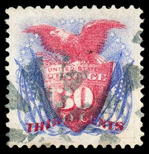
Drink it in, drink it in. It’s a used stamp, as evidenced by the grayish wedges of an old postmark that attest to its having done its job properly. Stuck on a letter, it showed that 30¢ had been paid for postage, perhaps to someplace overseas. Thirty cents was a good bit of money in 1869: domestic postage at the time was 3¢, so this represented ten times that—imagine a $5.80 stamp nowadays.
There is just enough of the cancel to show proper usage, without overpowering or obscuring the gentle details of the design, which is pure Americana: a red-white-and-blue study in patriotic iconography, at once bold and delicate, pushing the envelope of what was possible in multi-color reproduction technology at that time.
The ink colors (the Scott catalog refers to them in painterly fashion as “ultramarine and carmine”) are fresh and bright, the paper is clean and the little perforations around the edge are all intact. There’s no damage or any kind of faults. Most important of all, the margins between the printed design and the perforations are wide, even and well balanced.
I say most important of all because, for better or worse, that is one of the chief criteria by which philatelists grade a stamp. The Scott catalog, which is the standard reference for U.S. stamps, explains in its introduction how to judge a stamp’s centering, by showing digitally tweaked images of various issues. Here’s the illustration in Scott for the 1869 1¢:

Notice the example at the top is centered a little low and to the right. This is perfectly normal—many if not most examples of stamps in this issue look like this, and the philatelic description would be “fine to very fine.” But philatelists with high standards would hold out for something better.
The one in the middle is better, a solid “very fine,” and this is the grade that is priced in the Scott catalog. It’s a great looking 1¢ stamp—although, if we’re going to get picky, it’s still not perfect. The design could be a scooch better centered, right?
The example on the bottom of Scott’s illustration is pretty damn good, what philatelists would call “extremely fine.” Heck, many would call it “superb,” although if we got out the micrometer and started measuring really precisely, we might quibble that it’s mathematically possible to achieve better still: a “gem.” Regardless, a stamp like this is worth a big premium over the Scott value—collectors who have big wallets and a thirst for the best will gladly pay a four-figure price for it.
Speaking of math, there is a generally accepted numerical scale for grading the centering of a stamp. Though Scott doesn’t apply it, organizations like the non-profit Philatelic Foundation (PF) and the for-profit Professional Stamp Experts (PSE) do, based on a system codified in the early 2000’s. If you submit your stamp for a certificate of authenticity to either of these organizations (or one of the others, like PSAG), you can ask for a “graded cert,” which not only affirms your stamp’s genuineness and lack of faults, but assigns it a numerical grade.
If you want to read more, the PSE has an informative free book about it here and additional examples of 1869 stamps at various grades here. And while we take for granted that our discussion today is about a sound, fault-free stamp, that’s actually seldom the case; the PF has a good description of all the issues that can beset a stamp’s condition here.
Thanks to the near-perfect centering of its design within the perforations, lot 3211 in the Rumsey sale has been graded 95 by the PSE on a scale of 1-100, which puts it in a rarefied echelon. How rarefied? The PSE keeps a tally of how many stamps it has certified at each grade level. Here’s their census of Scott 121:

The line labeled “Used” is the one we’re interested in (the others refer to unused stamps with gum in varying degrees of preservation). Very fine—the grade Scott prices at—corresponds to 80; F-VF is 75, while XF is 90. As you can see, only a tiny number of stamps grade higher than that. While this population report is far from exhaustive, it’s representative—up to a point. PSE has never seen a single example of Scott 121 that would grade “gem” 98 or 100, though the PF has, which I’ll get to in a minute.
You’ll also notice the higher numbers come with or without a “J” suffix, which stands for “jumbo.” I’ll digress for a second to explain what that’s about. Stamps were perforated in the 19th century using one of two basic mechanical methods, known as line and comb perforating. In a nutshell, little pins chopped the holes between stamps, and those pins were either arranged on a fixed form in a comb-shaped layout punching a row at a time, with the width of each stamp’s perforations fixed, or on a set of wheels that rolled across the sheet in a line, like a pizza slicer. On the latter type of machine, which was the more widely used in the U.S., the wheels sometimes slid ever so slightly out of position, resulting in wider or narrower stamps. If a given stamp got lucky, it would up with extra-large margins in both directions, which collectors call a jumbo.
Rumsey’s description for lot 3211 indicates that they don’t entirely believe the grade it was given: “Three others have 95 Jumbo grades (with none higher), but this stamp is a rival to each and every one of them and we cannot understand the lack of a jumbo designation on this one.”
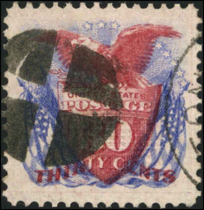
They can make that statement about the rivalry because, as experienced auctioneers, they’ve seen the competing stamps. You can see some of them, too, with just a little online research. Although PSE doesn’t show images of all the stamps it has certified, the PF does. I took a quick look at PFsearch.org, filtering for top grades and found nine 30¢ 1869s graded 95 and three graded 98, with one of those being a 98-Jumbo. Here it is:
Now, I certainly can’t speak for the grading services and every bidder will make their own determination, but I think Rumsey is probably right: one would *not* be crazy to buy the stamp in lot 3211 and resubmit it for a new certification, hoping to score better than a 95.
Other places to look for comparable results include StampAuctionNetwork’s Census/Provenance search, available to those who pay for the site’s Premium Extended Features. That brings up numerous examples, from past auctions at the site, graded 95—among them the other example of Scott 121 in next week’s sale (lot 3212) and an example Rumsey offered last December in their “Gems of Philately” sale:
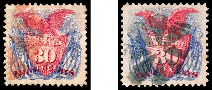
Both are terrific stamps deserving of their 95 grade, but if we’re being honest, the stamp offered in lot 3211 is slightly superior to both of them—it really is a great stamp.
So how does all this affect value? Scott offers some guidance in its Stamp Values catalog supplement, subtitled U.S. Specialized by Grade:
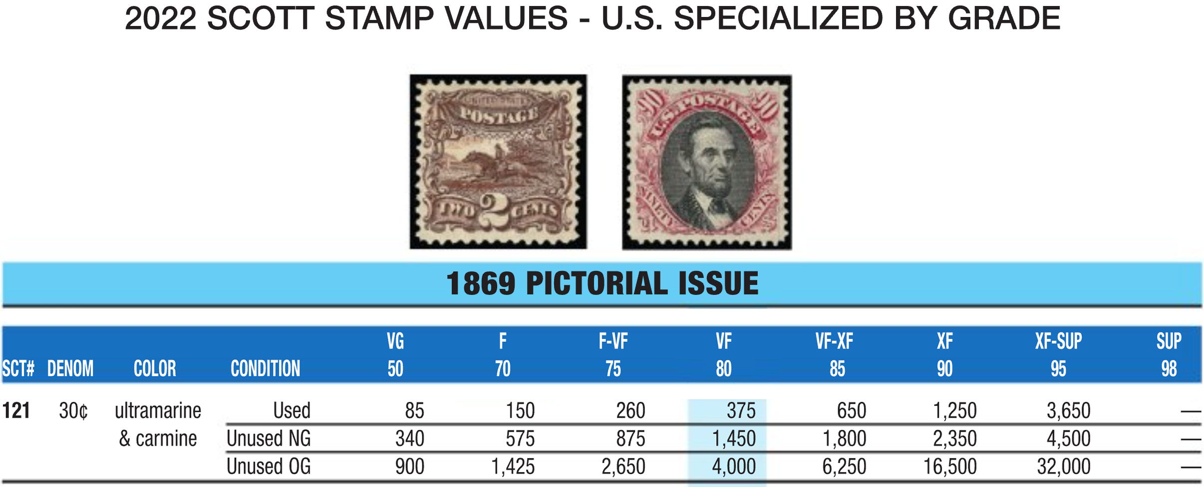
Whereas a used VF-80 stamp is $375, the value jumps to nearly ten times that amount when the grade rises to XF-Sup 95. This is close to the Stamp Market Quarterly value of $3,700 cited by Rumsey in the lot description.
Scott doesn’t give a value for any higher grade, because the market data is too thin; SMQ gives a value of $6,000 for a 95J. Nobody values a 98 or 98J—bidders will just have to use their imagination.
You’ve probably gotten the point by now what a great stamp this is. Let’s move on and look at a cover.
What Makes this Cover Great?
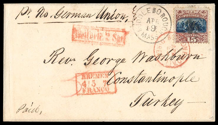
There’s a number of really nice 1869-issue covers in the Rumsey sale, bearing different stamps of the set from 1¢ to 15¢. Each is cool in its own way, but the 15¢ cover to Constantinople in lot 3205 really stands out.
I’ve written in the past about covers that hit the postal-history trifecta: great stamp, important destination/routing/postal rate, and notable recipient. This is such a cover.
The stamp is decent example of the 15¢, type II (remember earlier I mentioned this stamp comes in two versions? This one has a little extra brown shading above and to the sides of the vignette). Listed in Scott as no. 119, the design shows Columbus Landing in the New World, a key moment in America’s foundation mythology.
This example is centered low within its perforations, but as we know, that’s normal and really of little consequence. Rumsey notes that a grand total of six covers have survived in collectors’ hands bearing Scott 119 and addressed to Turkey, so if you’re a collector who specializes in the postal history of the 1869 series, this would be an example of “destination mail” you’d be very interested in owning.
The black postmark tells us the letter was mailed in Middleborough, Mass on April 19 (other indications on the cover tell us the year was 1870). The red circular cancel just below reads “Boston Paid All Direct Apr. 20” which tells us the letter was processed the following day at what was called an Exchange Post Office, where it was bundled into a mail bag going via the North German Union, a pre-unification amalgam of states.
From Boston, the mailbag containing the letter traveled by train to New York, where it was put aboard the North German Lloyd steamship Hermann on April 21 (we know this from detailed records of all 19th century ship sailings); it arrived in Bremen on May 4, as noted by the red rectangle dated 4-5-70, below “George.” The word “Franco” in that marking indicates the letter was fully prepaid.
The German post office had to indicate this because in the olden days, prior to the Universal Postal Union in 1874, a letter’s transit through other countries and delivery at its destination could sometimes be prepaid, sometimes not, depending on whatever bilateral treaties happened to be in place between the nations involved. At the time this particular letter was sent, there were treaties governing rates from the U.S. via Germany to the Ottoman Empire, and one could send a letter prepaid all the way for 15¢ (hence the “Direct” in the red circular date-stamp). The Germans would take their 5¢ out of that total (indicated by the red pencil “5” below the “Rev.” in the address) for handling from the seaport of Bremen onward by train. This was translated into German currency, 2 silbergroschen, by the red rectangular hand-stamp just above “George.”
Rumsey describes this cover as “from the Washburn correspondence,” but that conceals a fascinating biography: George Washburn, an American educator and missionary, spent 50 years in Constantinople, serving as president of Robert College—a kind of Ottoman Eton whose alumni included future prime ministers of Turkey and Bulgaria. Washburn's memoir, detailing many of the historic events he witnessed, was published in the early 1900s. Having this cover in your collection gives you more than just an interesting item of postal history. It offers a personal connection to a notable historical figure.
So that’s a pretty great cover that hits all the major notes/beats. Rumsey estimates it will bring $1,500 to $2,000. I’ll certainly be watching to see how it does.
That’s it for today. If you like this newsletter, please subscribe (it’s free!) and feel free to share this with all your friends.
Til tomorrow,
_____
Postscript: The items discussed above reached the following realizations in Rumsey’s sale of Aug. 27, 2022, including the 18% buyer’s premium:
lot 3211, the extremely fine 1869 30¢ stamp: $4,720
lot 3205, the cover to Rev. Geo. Washburn in Constantinople: $3,186